DOUBLE PAGE SPREAD ANALYSIS
Layout of Double Page Spread
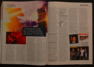
The layout of this Q magazine double page spread is very simple but effective and although it is a double page spread it actually has four pages for the interview. It has the large picture of the featuring artist 'Brandon Flowers' on one side and the start of the interview on the left. This is a similar style that I plan to construct my double page spread in. The text is positioned into three columns on this page and there is more on the following two pages.
This is the second of the four page interview and it has a lot more text on it with lots of small images so that the page is not just filled with text. There is a medium sized picture at the start of the two pages following with another small image and the continuing of the interview. The interview is carried over to the other side with some more small images in the bottom right hand corner. The layout of these two pages is very precise and well aligned with text wrap around the pictures and there is 8 columns for the text.
The next magazine is also from Q and is is a normal double page spread consisting of just two pages. The layout is again, very precise and well structured as the text is wrapped around the images also displaying 8 columns and there are no random elements or obscured features on the pages. The image is not as large on this double page spread however, it is such a high quality picture is doesn't need to be that big to dominate the page. There is also a lot of space in the top left hand corner where the pull quote and the name of the featuring artist 'Charlotte Church' is being mentioned.
The layout of this double page spread is very different from the other magazines as it features a band called 'Muse' instead of a solo artist so the layout will obviously be different. The image takes up most of the A3 Landscape page with the start of the interview in the bottom right hand corner. This double page spread is another four page article which is what a lot of modern magazine are doing with interviews as they want to get more pictures and information inside.
Contents of Double Page Spread
The content of the NME double page spread featuring the band "Muse" is quite vague as the pull quote could be referring to anything, however we can pick up a bit more about the content from the brief description below which tells us that the sketch was of an idea to a costume and production to make their gigs more exciting. The pull quote is a good idea to have something vague as the reader may wonder what it's about and they may be intrigued to read the interview and find out.
The content of the 'Brandon Flowers' interview for Q Magazine is very much about his personal statement that he wants to send a public message to the public. This is also a good idea to have as a pull quote on a double page spread as is gives the reader an idea of emotion behind the artist and draws them into the interview so they feel more connected with the artist. The statement is very punchy and bold as he is expressing his opinion to everyone and this becomes powerful as they have put it in capitals and made the name of the artist smaller underneath to make the quote seem more dominant and overpowering.
Design Elements Used
This design element is similar to the one above however it is the background for the drops cap. It is not just a black square, it has a design element to it because of the pattern of small white dots in the background which is hard to see from a distance however, it is another effective small feature that makes the page look more enticing.
The last design element used is an example of another custom shape which acts as a sticker on the page firstly a white circle is created, then a black one is placed over the top to which the text is then at the front making it look like a sticker. This background makes the text stand out more to the readers eye, because if the text was alone is would not be as easily noticeable as it is in the current image.
Text and Pull Quote Positioning
The positioning of this drops cap is made to be larger than the rest of the text as this is what a lot of professional magazines do however they usually just do the first letter, but in this case a whole word has been selected to be the drops cap, which is unique and more interesting.
A lot of pictures in double page spreads usually have a box placed over the top of the image with a pull quote to explain the image and this is an element I have used in my contents page and may wish to repeat into my double page spread. It is an effective feature as it explain the picture with a brief description or phrase and looks professional if designed well enough. The positioning of the box and the text is usually placed either in the corner of the image where there is more space or overlapping the image and nearer to the interview text.
The positioning of this pull quote is on the left of the two pages again, where there is more space as the pull quote would look odd if placed over the figure of one of the band members.
This pull quote on the right of the two pages is positioned like many magazines use. A large picture is on one side of the page with a lot of space around the figure and then place a large pull quote in the background space. This is a feature that I would like to incorporate into my double page spread as I feel it looks very effective and professional.
Language and Vocabulary Used
Most music magazine use a mixture of formal and informal language depending on the genre of their magazine and the featuring artist of that edition. In my genre of my magazines there is more likely to be informal language used and quite often some profanities and expletives used to emphasise the phrase or catch the eye of a customer/reader. In this image you can see the pull quote has an expletive which is cleverly constructed as they are running away and they have dragged out the 'U' to make it seem as if they were saying that when running from something. The profanity they have used suggests they are in some sort of trouble and instead of saying "We are in so much trouble!" which is pretty plain and boring, instead they have decided to use an expletive to make the phrase more powerful and eye catching.
Number of Questions Asked
The average number of questions asked in a double page spread article ranges in different magazines, however in this magazine there are a lot of questions asked in just two pages of A4. There are 18 questions asked in total as you can see I have circled all the questions in the interview. The questions are put in bold so you can easily identify where the questions are and it separates them from the answers the artist gives.
This double page spread has only 7 questions asked in this interview which is a lot less than the one above but it does vary a lot in different magazines depending on wether they want more text than pictures or more pictures to make the page more visual. The way the interview is laid out usually is to have a small introduction at the start from the interviewer themselves and then start the questions as they meet the artist.
Image Portrayal
This image is such a clear photo as she is appearing through some trees and not much is given away but it reveals the idea of hiding away and coming out from the darkness which is what the story is about on the 'Charlotte Church' double page spread, she is on a comeback with her music. The gaze and direction is not straight at the camera which sometimes is more effective as it looks more interesting and the focus is on Charlotte with the trees looking more blurry.
The image on this page is more like the image I want to use for my double page spread as the male dominates the pages completely, all the attention is on him and his posture is very upright and confident and if he doesn't care about anyone's opinion of him. This again relates to the story as you can see in the pull quote, this is an important feature to have in a double page spread as the image portrayal should relate to the storyline.
Colour Schemes and House Styles/Brand Identity Throughout The Magazine


No comments:
Post a Comment