Saturday, 9 March 2013

Evaluation Question 7

Evaluation Question 7

Looking back at your preliminary task (the school magazine task), what do you feel you have learnt in the progression from it to full product?
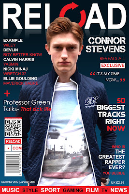
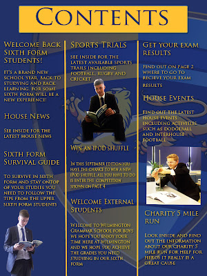


Since creating my preliminary task I have learnt a massive amount in terms of aesthetic features and media conventions used on magazines. Researching and analysing existing media conventions before I made my music magazine also helped me massively in my progressive learning experience. I have also increased my understanding of technology using resources such as Photoshop, Adobe InDesign, Final Cut, Quicktime, iMovie and equipment like High Definition Cameras, Tripods and Artificial lighting. My knowledge of the media market and magazine industry has also increased a lot due to the research into different media groups and magazine companies.

Whilst creating my magazine and researching into the urban genre I thoroughly looked into the way existing media products portray there genre and one of the main ways they did this was the environment and background of their images throughout the magazine. So when constructing my magazine and taking pictures I ensure the area and environment was urban which relates to my magazine genre. For example for my contents page I have used two examples of brick walls and graffiti which are stereotypically associated with the urban social group.


I also learnt a lot in terms of taking images as the poses and positioning in some of the photos, especially the front cover photo, needs to be striking and dominant. To do this the facial expressions need to be intriguing as if the reader would like to know more about them. Also the body gesture of the male needs to look dominant and powerful as if they look like they are in control. If you look back to the images I took on my preliminary task front cover and contents page they are not as eye catching as my music magazine images. The images below are very boring and not well set up as in I didn't position them into a place where I was able to take an effective front cover photo. Also the background/environment does not portray the genre of the magazine which was a school magazine and I have taken the images on a balcony and beside a tree. Also you can tell that I have learnt a lot in terms of layout, house style and colour coordination which I didn't incorporate into my preliminary task too well as in my music magazine I have used conventions of a unified house style, clear and effective layout and a well colour coordinated design.


I have approached the two tasks with my best efforts in mind, however my time management was significantly different in terms of time spent making and perfecting certain aspects of the media product. In my preliminary task I didn't spend long on constructing the front cover and contents page and I spent longer going out and taking the images. Although we weren't allocated a lot of time for the preliminary task, if I was to go back and do it again I would certainly improve it massively from what I have learnt in a year whilst creating my music magazine. I have spent a significant amount of time adjusting and perfecting certain elements of my music magazine to ensure I pick up the extra marks. For example, fonts colours, font styles and image positioning.

I have learnt how to gather feedback to improve my front cover contents page and double page spread in order to develop my work further to look better. Below are the pieces of feedback I got my front cover, contents page and double page spread.


This demonstrates my ability to take constructive criticism and incorporate it into my work to improve it further. I also took the positive comments into consideration to understand and identify what works well together.

I have also developed my understanding of software programmes massively using Adobe Photoshop and InDesign to help me construct my magazine with more effective tools to make my magazine look more professional and increased my awareness in layout and style. Using software programmes also developed me to create interactivity on my posts. I have learnt to use a variety of different tools creating professional effects in both Photoshop and InDesign which I could now do without having to think about it. I have learnt to also create a CD and Album Cover in Photoshop which I went out of my way to create and show my progression of skills in Photoshop. Another feature I have used to highlight my developed ability in Photoshop is putting my magazine front cover onto a bus stop advertising board which shows my desire to present my ideas on how the magazine would actually be published.


Evaluation Question 6

Evaluation Question 6
  
What have you learnt about technologies from the process of constructing this product?


Evaluation Question 5

Evaluation Question 5

How did you attract/address your audience?

For this question I have decided to take advantage of the technology I am able to access and create a small video that presents how I attracted my audience by videoing a member of the urban social group to explain what attracted them to my magazine looking at the front cover, contents page and double page spread. Following on with the following questions:
  
1. Do you think this publication could exist as a real media product? (Is it realistic)
2. What are the strongest elements which appeal to you & clearly distinguish the genre?
3. Do you feel the pictures included are relevant to the genre of the magazine?
4. What features of this product could relate to other existing products?
4. Would you buy the magazine?


Features I used to attract my audience:


As you can see here on my front cover of my magazine I have used various features to attract my audience which is of the urban social group. To attract an urban audience I needed to relate to that genre and I have done this by putting up cover lines with featuring urban artists so it immediately appeals to urban users, as you can see in the video the customer wanted to buy the magazine as he was interested in the cover lines and wanted to read more. Also the use of the bold title was mentioned a lot in the video with the reloading sign which is a unique feature that a lot of urban magazines include such as RWD magazine. The style and clothing of the model needed to be urban to attract the audience so when taking my photos I ensured I was following an urban style and trend with my model wearing a casual t shirt and jeans with a smart bomber jacket over the top.


On my contents page I used conventions and features such as urban style of clothing to attract my audience. As you can see the models in the pictures are wearing casual clothing such as t-shirts, jeans and trainers. One of the pictures even has a snap back on which is a familiar accessory used in the urban industry of music magazines. I also used interesting and eye catching features on the left hand side which will appeal to the reader if they fall under the urban category. I have ensured I made the main statements bigger than the text underneath as it stands out more to the eye of the reader. The environment I took my photos in also correspond the urban genre as there are two pictures with brick walls in the background. Another feature on my contents page I used are the event reviews which appeal to the audience as they might be interested in some of the urban artists playing at the festivals. All of these conventions appeal to the urban social group which would be most likely to pick up my magazine on a magazine rack. 


On my double page spread I have ensured that my model follows the same style I have used consistently throughout by advising him to wear jeans, t-shirt and a leather jacket. Also the content I have included in the article of the double page spread uses some informal language which relates to the urban genre using slang in the text.

Monday, 4 March 2013

Evaluation Question 4

Evaluation Question 4

Who would be the audience for your media product?

The target audience for my media product would obviously be aimed and directed at the urban social group. When answering this question I have to take into consideration the reasons as to how my media product is suited to the urban category. I have used certain conventions and features throughout my magazine to relate to the urban group. I have considered the clothing when taking my image as I made the model wear urban clothing to portray the genre of the magazine. I also have used informal fonts and phrases throughout my magazine such as "Tracks" and "Sick" which is a prominent example below.


Going back to my original research into UK Tribes I discovered that my media product falls under the category of Urban on the UK Tribes website. As you can see above people who are referred to as Urban, generally listen to urban music, wear urban clothes and are influenced by urban environments. Compared to other social groups such as indie, rock or emo for example are substantially different to the urban group, however urban can be broken down into different categories such as rap, grime, hip-hop and RnB. My magazine takes the route of rap with a grime artist featuring on the front cover. Below is a drawing I have done in pencil of a rough member of someone classed in the urban social group and as you can see he is in an urban environment with brick walls and graffiti behind him and his clothing represents that urban vibe as he is wearing a casual branded t-shirt, sunglasses and jeans.