Thursday, 20 December 2012
Cover Lines Planning
Title- RELOAD
Featuring Artists- Main Artist Exclusive
Interview- Connor Stevens Wiley
Devlin
Giggs Quote from Connor Stevens
Ellie Goulding
Nicki Minaj " "
Boy Better Know Main Image
Wretch 32
Yasmin
Example
Calvin
Maverick Sabre
Interview with a famous artist- 50 biggest tunes right now!
Either Professor Green or Example
Barcode
QR Code
Website Who is the greatest rapper ever?
You decide
Date Issue
Header- Music Style Sport TV News Film Gaming
Sunday, 16 December 2012
Magazine Colours and Cover Lines Research
The colours I am aiming for on my front cover of my Magazine are similar to the two magazines on show here. Because of the blue baseball jacket my model is wearing it would be a good idea to match the blue jacket with a blue background. The model in this magazine is also wearing blue clothing which blends in with the background. In my research I have found that most magazines use red throughout the magazine as it makes text stand out more. I am going to use the colour scheme of red, white, blue and black throughout the magazine on my front cover, contents page and double page spread. The mix of red blue and white look really effective when put together. I am going to use this mix of colours on the front of my magazine.
This edition of RWD Magazine also follows the same colour scheme as I wish to incorporate into my front cover. The mix of blue red and white really complements the model and is easy to read. I am going to make my title with a red font however leaving the 'O' in white as it will have a logo of a reload sign, following the name of my title. The type of blue I want to use for my background is a dark turquoise colour which makes the white and red text more appealing and noticeable. The cover lines on this edition of RWD magazine is more likely the style and shapeI would follow rather than the magazine above, simply because my model is roughly the same size as the model on the RWD magazine front cover. I am going to write the list of artist names featuring inside my magazine plus an exclusive with a famous artist. I will include some features from the VIBE magazine above such as the barcode, a header at the top of the page above the title and some quotes from artists. The types of cover lines I have looked at to use on my front cover are again, similar to this magazine as they use aligned, straight edged cover lines.
Thursday, 13 December 2012
Front Cover Construction 3
Another change I wanted to make to my front cover was the background. I wanted to change it to white as I feel it would look better. All I did to change the background was to go to the fill paint bucket tool and select the background as the colour on my gradient was already white. The paint bucket tool is on the tool bar on the left. (below)
Furthermore, the gradient tool was selected so I then clicked where I wanted the reflection on the second title to stop and dragged down from the middle of the two titles.
Now I had a layer mask on the second title I selected the gradient tool which will give it a reflective effect. I selected it on the tool bar on the left.
Next, I flipped the second title vertically to make it the opposite way round to the original title just like a reflection would be. I did this by right clicking on the second title and then clicking flip vertical.
Continuing on, I next wanted to add some effects to my title. I wanted to create a reflection effect. To do I started by clicking duplicate layer to create two of the same title. I did this by right clicking on the title that is in the bar in the bottom right corner and it comes up with a tab and I then clicked duplicate layer which is highlighted in the image.
FRONT COVER CONSTRUCTION 3
Front Cover Construction 2
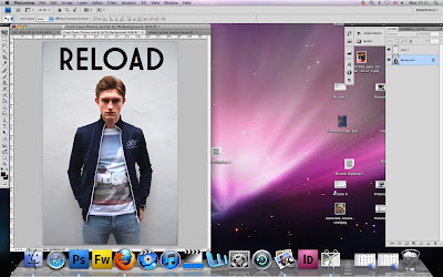
The title is simple at the moment but later on I will be adding colour and some effects to make it stand out more and seem more interesting to customers. I wanted the font to be positioned above the models head as this is what most of the magazines do, which I found out when researching into the music magazine market.
The title was inserted into a new page and all I had to do was to click on the title and drag it into my other page where I already had my model. I had to hold it down onto the other page for a few seconds before it transferred into the other page. Once is transferred I kept holding down on the mouse and dragged it into the position I wanted it to be placed.
After I had finished editing my model, I decided to insert my title that I got from the website www.dafont.com where you can type in the name of your title and choose the font you want. I went for a simple but bold font which is what Vibe and RWD magazine have on their front page as I found out in my research. To open the title I had already saved it so all I had to do was go to File -----> Open then search for my font, click on it and press open.
This screen grab is after I had finished using the spot healing brush and as you can see the two images are different if you look closely you can see there are no imperfections on my models face or neck.
Continuing on from my last development of editing my front cover I now
wanted to clear up any imperfections on my models face such as spots,
blemishes or uneven areas. To do this I used the spot healing tool
(above) selected on the tool bar on the left. I made the tool size 15 which is
relatively small and patched up any spots or imperfections I could see
on his face
FRONT COVER CONSTRUCTION 2
Wednesday, 12 December 2012
Front Cover Construction
Next, I wanted to actually edit the body of my model. I wanted to enhance the colour and brightness on his clothing and face so I went to Image ------> Adjustments -------> Brightness and Contrast. Once I had selected what I wanted I was able to then change it and play around with how I wanted it to look until I decided I was pleased with the outcome.
Once I had selected his body and all the features that I wanted to edit, I went to select --------> inverse because at this point I was selecting everything apart from the figure of the body. Clicking on inverse selects the figure of the body and this is the only part that is currently selected. This would now enable me to edit the body without changing anything in the background.
This is the first part of editing my model, I cut his figure/body out with the quick selection tool (below) by dragging around his body and zooming in to make sure I correctly selected the parts I wanted. In certain areas It was harder to select around the body as they are a similar colour to the background and it doesn't pick up the colour as well on Photoshop. So I had to zoom in closer and accurately select the parts I wanted.
This is a screen grab of my original picture of my model for my front cover that I am using. I am going to start making my front cover of my magazine, on Photoshop, from here and this is the starting point. I am going to create a very urban look to the cover of my magazine including urban fonts and maybe some slang.
FRONT COVER CONSTRUCTION
Sunday, 9 December 2012
Final Front Cover Photo
I have decided to use this photo for my front cover because I like the clothes he is wearing and the posture he is standing in. I have edited this picture in Photoshop to take away any imperfections and I have turned the contrast and brightness up slightly to give him a more enhanced look when standing out on the front cover of my magazine. I aim to select his body and put the figure on either a white or black background, with cover lines wrapped around his body depending on the colour of the background. I am going to maybe have the title above his head but I am not decided yet on weather to put the title slightly behind his head as this is what the magazines do in my Magazine Genre Inspiration. The colours of font and for the title of my magazine are maybe going to be blue, black and white as I have researched that the house style of magazines I am following mostly have three colours that flow without the magazine, also these colours in the text and title are usually found on the clothes of the model so that the unified house style all fits in together.
Subscribe to:
Posts (Atom)